Using CSS grid and flexbox together
I’ve noticed a bit of confusion about CSS layout with grid and flexbox. Some people seem to be thinking they are different tools for the same job, or that grid is a replacement for flexbox.
Neither is the case, and in fact they work well together to solve some common layout problems. After a brief overview of the differences as I’ve encountered them, I’ve created two examples of combining grid and flexbox based on some real world designs I’ve implemented.
Broad brush differences between grid and flexbox
Without going into too much detail, and speaking in very general terms, there are two main differences between grid and flexbox.
Firstly I tend to put flexbox layouts inside grid layout cells. There’s nothing in either spec to say that’s what you have to do, and there are times where it would make sense to put a grid inside a flex item (for example a colour swatch in a product card). However the vast majority of times I’ve used them together the grid is used for a larger layout and flexbox for smaller components.
The other difference to bear in mind is that flexbox is great for laying out 1-dimensional structures (think form with 2 inputs and a submit button and card-type components). Grid on the other hand is great for 2-dimensional structures like photo galleries and page layouts.
I must stress though that if you want to pick the best one for the job you should take a deeper dive than that into both grid and flexbox. The 1-D/2-D guide isn’t a hard and fast rule.
I find myself returning to Rachel Andrew’s blog, the CSS-Tricks guides to grid and flexbox, and Jen Simmons’ Layout Land YouTube channel to learn about modern CSS layout.
A simple example
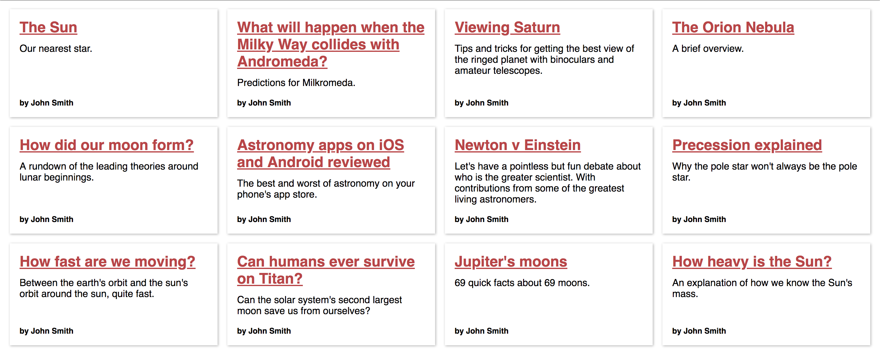
This could work for any type of card but I’ve gone for articles in a fictitious astronomy blog for this example. What we’re going for is a grid of equal height cards across each row, each with a little footer content aligned along each row.

Codepen demo: https://codepen.io/derekjohnson/pen/BVWPRV
In this case I’ve used grid’s responsive-in-1-line-of-CSS trick for the main layout.
As you can see each card has the author name at the bottom and aligned horizontally even though the titles and intro paragraphs are different lengths. This is achieved with flex: 1 on the paragraph.( margin-top: auto on the span element does the same job when it’s inside a flex container.)
In total I used 6 CSS declarations for this layout and didn’t have to resort to fixed heights or absolute positioning to make it look nice and tidy.
A more complex example
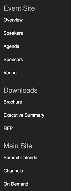
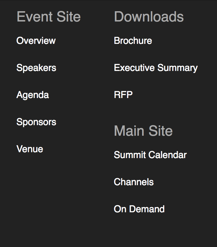
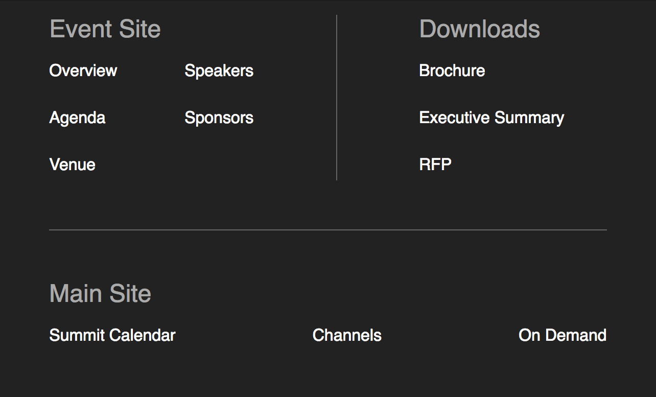
This next example is a footer with 4 layouts depending on the viewport width. Before grid and flexbox I might have looked for a compromise with the designer as this could be quite fragile and verging on the impractical using older techniques.


Codepen demo: https://codepen.io/derekjohnson/pen/zawwBa?editors=1100
There’s quite a bit more to unpack here. First of all media queries are involved in the largest two layouts.
The two smaller layouts are controlled by the responsive-in-1-line-of-CSS trick, swapping when the available room allows.
In medium and larger viewports we move to a more declarative approach with straight up fr units in a fixed number of columns.
One thing to notice is how flexbox is used for a 2-dimensional layout of the <li>s in the Event Site section, and grid ends up as a 1-dimensional layout in the widest viewports. That’s just what made most sense to me based on my experience using grid and flexbox.
Anyway, it’s better to play with it on Codepen than have me create confusion by trying to explain it any further!
So use grid, use flexbox and use them together, they’re a great combo. And don’t forget the fallbacks, they’re easier than you might think.